Welcome to the Bootstrap Workshop
Ryan Cosentino
Goal
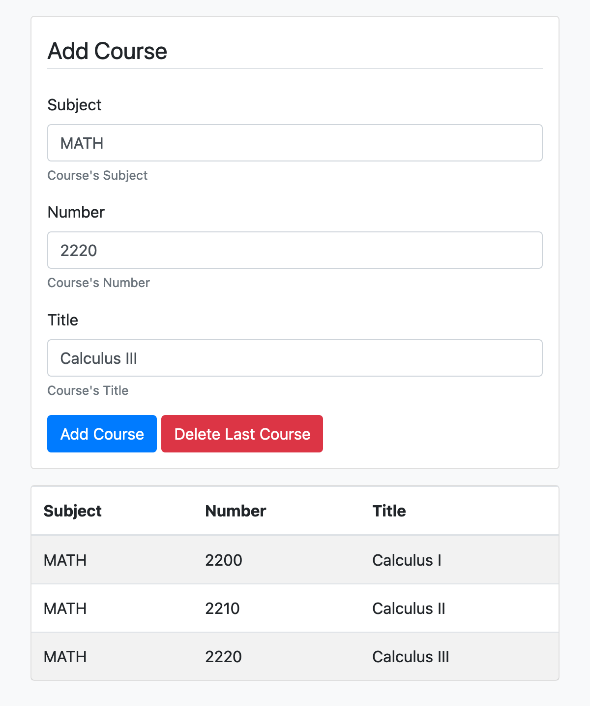
The goal of this workshop is to use Bootstrap and jQuery to create a form that can add or remove courses from a table:
What is Bootstrap?
Bootstrap is a widely used CSS framework that can be used to easily and consistently style HTML elements using CSS and (optionally) JavaScript. Bootstrap contains styled components for buttons, cards, dropdowns, input groups, navigation bars, tooltips, and many others, along with utility classes for common CSS properties.
Bootstrap was originally developed at Twitter for their internal web applications but was eventually released to the public as an open source project in 2011.
Bootstrap’s documentation can be found here and their source code (GitHub) here.
“Installing” Bootstrap
Similar to jQuery, while Bootstrap can be downloaded and used locally, it is commonly accessed via a CDN (content delivery network).
Visit the following link and replace the default HTML in the editor with the following:
<!DOCTYPE html>
<html>
<head>
	<meta charset="utf-8">
	<meta name="viewport" content="width=device-width, initial-scale=1, shrink-to-fit=no">

	<title>Add Courses to Table</title>

	<link rel="stylesheet" href="https://cdn.jsdelivr.net/npm/bootstrap@4.6.0/dist/css/bootstrap.min.css">
</head>

<body class="container-fluid">

	<script src="https://code.jquery.com/jquery-3.5.1.min.js"></script>

	<script>
		// Your Code
	</script>
</body>
</html>
“Installing” Bootstrap
Clicking the “Run” button will load your HTML.
The <link> tag downloads the Bootstrap CSS styles. Note that some components need JavaScript and require an additional script tag, however we won’t we using those components here.
Spacing Classes
One of the most helpful Bootstrap utility CSS classes are those made for setting padding and margins. They are named using the format:
{property}{sides}-{size}
Where property can be:
m- to set marginp- to set padding
Spacing Classes
{property}{sides}-{size}
Where sides can be:
t- topb- bottoml- leftr- rightx- left and righty- top and bottom- blank - sets all 4 sides
Spacing Classes
{property}{sides}-{size}
Where size can be:
0- set value to01- set value tospacer * .252- set value to$spacer * .53- set value to$spacer4- set value to$spacer * 1.55- set value to$spacer * 3auto- set value toauto
Spacing Classes
Examples include
m-0sets all margins to 0mb-2sets a medium bottom marginpl-5sets a large left paddingpx-1sets a small left and right padding
These can be used to easily add padding and margins to elements without inline CSS or having to define rules in an additional style sheet.
Bootstrap Colors
There are a set of main colors that can be applied to many Bootstrap components:
primary
secondary
success
danger
warning
info
white
light
dark
Bootstrap Colors
For example, the background utility classes are:
Bootstrap Colors
Lets give our page a light gray background:
<body class="container-fluid bg-light">

	<script src="https://code.jquery.com/jquery-3.5.1.min.js"></script>

	<script>
		// Your Code
	</script>
</body>
Cards
Now let’s move on to Bootstrap components which are physical elements displayed on the page.
A card is a flexible and extensible container with rounded borders. Add the following to the top of your body, where we’re creating a card with a medium margin and padding:
<body class="container-fluid bg-light">

	<div class="card m-3 p-3">
		hello
	</div>

	...
</body>
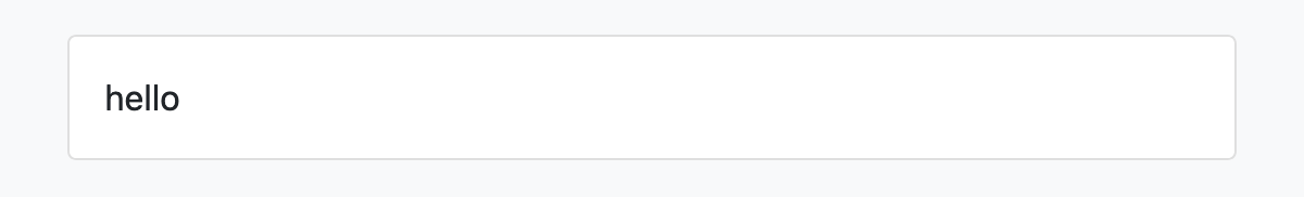
Cards
After pressing Run, you should see something like this:
Form Text Fields
In this card we’ll make a form that creates courses. Replace the text hello with the following:
<div class="card m-3 p-3">
	<legend class="border-bottom mb-4">Add Course</legend>
	<div class="form-group">
		<label>Subject</label>
		<input type="text" class="form-control" id="subject">
		<small class="form-text text-muted">Course's Subject</small>
	</div>
</div>
Here, the legend tag acts like a title and we’re giving it a bottom border and large bottom margin. The input element will be stylized since it has the form-control Bootstrap class.
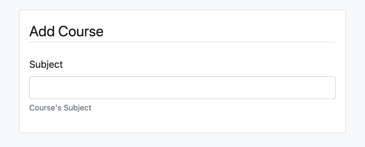
Form Text Fields
After pressing Run, you should see something like this:
Form Text Fields
Now lets add an input for the course number and title:
<div class="card m-3 p-3">
	<legend class="border-bottom mb-4">Add Course</legend>
	<div class="form-group">
		<label>Subject</label>
		<input type="text" class="form-control" id="subject">
		<small class="form-text text-muted">Course's Subject</small>
	</div>
	<div class="form-group">
		<label>Number</label>
		<input type="text" class="form-control" id="number">
		<small class="form-text text-muted">Course's Number</small>
	</div>
	<div class="form-group">
		<label>Title</label>
		<input type="text" class="form-control" id="title">
		<small class="form-text text-muted">Course's Title</small>
	</div>
</div>
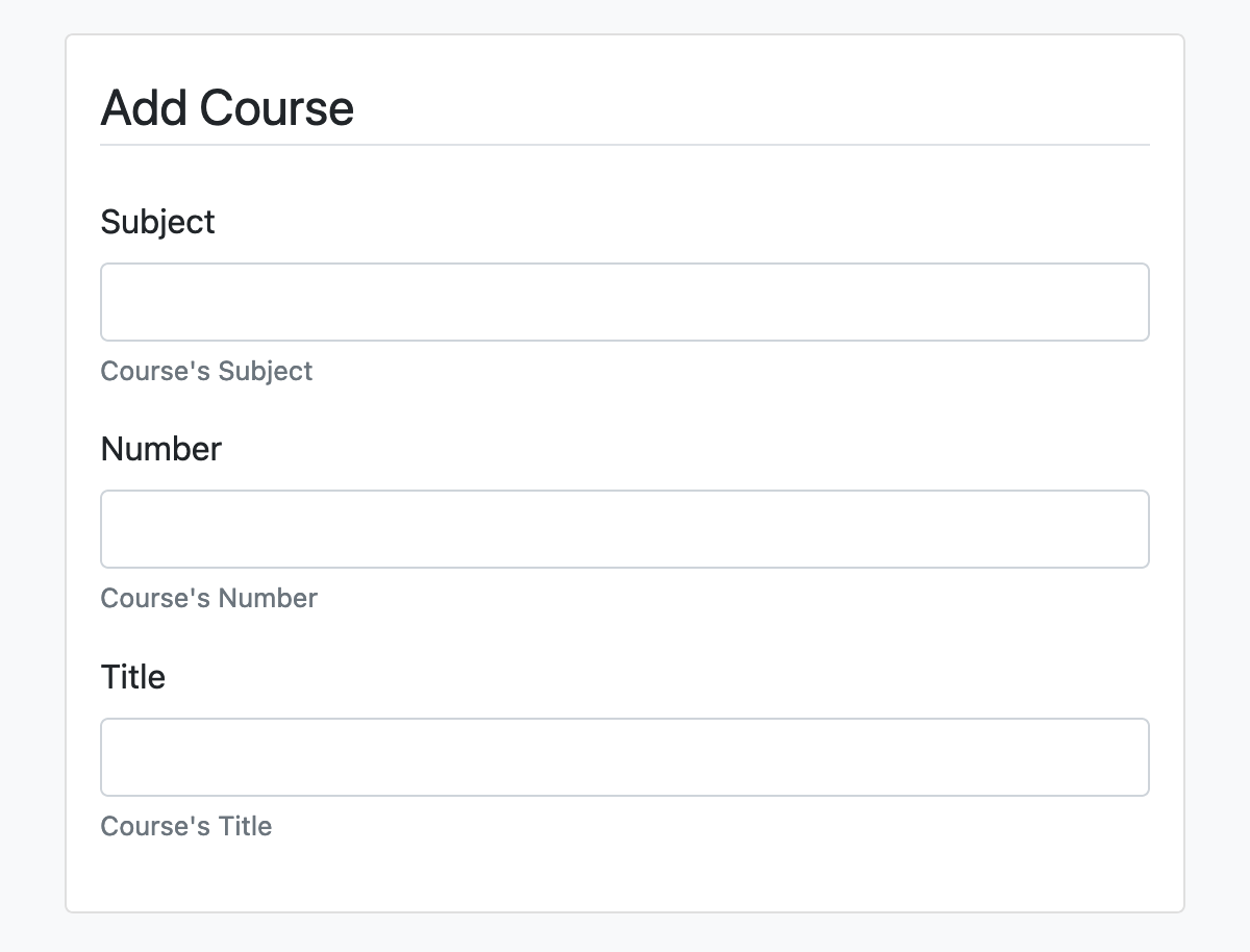
Form Text Fields
After pressing Run, you should see something like this:
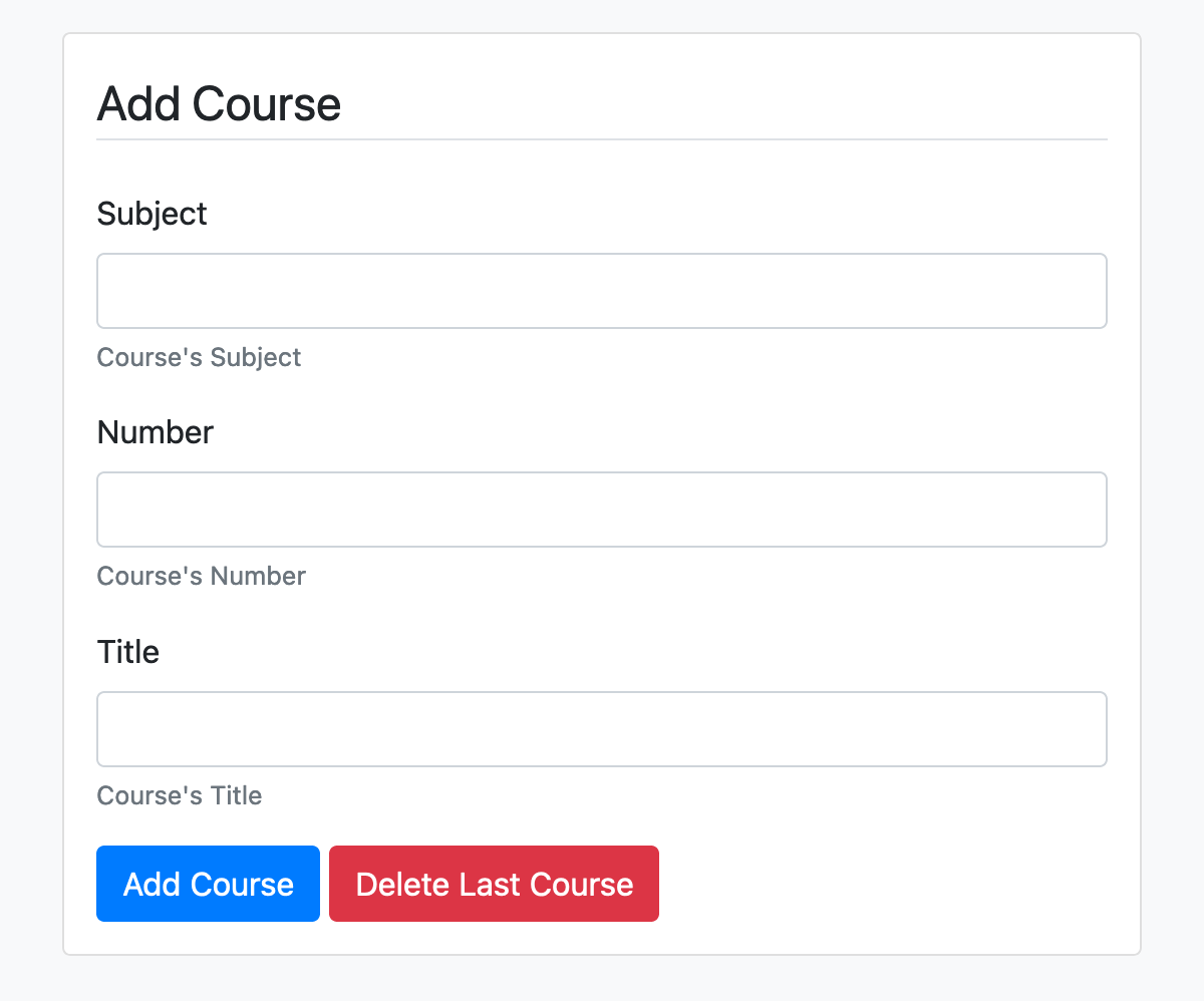
Form Buttons
Now lets add two buttons for creating and deleting courses:
<div class="card m-3 p-3">
	...
	<div class="form-group">
		<label>Title</label>
		<input type="text" class="form-control" id="title">
		<small class="form-text text-muted">Course's Title</small>
	</div>
	<div>
		<button id="add-course" type="submit" class="btn btn-primary">Add Course</button>
		<button id="delete-course" type="button" class="btn btn-danger">Delete Last Course</button>
	</div>
</div>
Here, the btn class activates the Bootstrap styles and the btn-color class colors the button, where color can be any of the previously mentioned colors.
Form Buttons
After pressing Run, you should see something like this:
Tables
Now lets create a table under the form which will list our courses:
<div class="card m-3 p-3">
	...
</div>

<div class="card m-3">
	<table id="courses" class="table table-striped mb-0">
		<thead><tr><th>Subject</th><th>Number</th><th>Title</th></tr></thead>
		<tbody></tbody>
	</table>
</div>
Here, the table class activates the Bootstrap styles and the table-striped class makes the rows alternate between a white and gray background.
JavaScript
The only thing left is to program our “Add Course” and “Delete Last Course” buttons. To do this we’ll use jQuery.
In the last script tag (the one with a comment), add the following:
<script>
	table = $("table#courses > tbody")
</script>
JavaScript - Add
For the first button, we need to read all three input fields and use their values to construct a table row, then add the row to the end of the table:
<script>
	table = $("table#courses > tbody")
	$("button#add-course").click(function() {
		table.append(`<tr>
			<td>${$("#subject").val()}</td>
			<td>${$("#number").val()}</td>
			<td>${$("#title").val()}</td>
		</tr>`);
	});
</script>
JavaScript - Delete
For the second button, we need to delete the last row in the table:
<script>
	table = $("table#courses > tbody")
	$("button#add-course").click(function() {
		table.append(`<tr>
			<td>${$("#subject").val()}</td>
			<td>${$("#number").val()}</td>
			<td>${$("#title").val()}</td>
		</tr>`);
	});
	$("button#delete-course").click(function() {
		table.children().last().remove();
	});
</script>
Result